I am from the evergreen tree, the mountain’s shadow.

Image source: Amanda McCann

I am from the evergreen tree, the mountain’s shadow.
Image source: Amanda McCann
Visiting with the students from AUM was a great way to bring an end to the semester. After working with them for the past few months it was great to finally see the faces behind the blogs and get to hear their stories. The AUMer I spent the most time talking to was That Inane Laugh. The map of Montgomery that she created had a lot of familiar locations, like stores and restaurants, but she also selected a few places that had special meaning to her. Her map and the emotions behind it, made me think of my home. I kept thinking about how all the places I lived or went had some meaning to me (okay maybe not everywhere, I have never had a life-changing moment walking through Walmart to get groceries). Places like my old house where I spent eight years sharing a room with my younger sister or the daycare I went to as a child where I found my love for learning. These places and more have shaped me and it was fascinating to see how the places marked on That Inane Laugh’s map showed how the places she has been have shaped her life.
When I really started thinking about it, I realized that the individual maps we made for the AUM students shared a lot about us, even if they weren’t about a home town. Before working with maps and making my own, I had never really paid attention to the personal information we can gain from a map. Now, I can help, but try to look for the person behind the map and wonder what their story is.

Those of us who go to Oklahoma City University can see this map and understand that it is the Dawson-Loeffler Science and Mathematics Building on campus. On second thought, some students on campus do not know very much about this building because they spend all their time in the dance school or in acting classes across the rest of campus. This is a big reason I chose this place for my map because it is slightly mysterious to people who live less than a quarter mile away from it. Loeffler is often the ignored building on campus, unless you are a science student like I am, then you spend all of your time there. That is the second reason I chose Loffler, I know this building better than most everywhere else in Oklahoma (I obviously need to get out more). Since there is so much unknown about Loeffler, I had the opportunity to let my imagination take over and turn the science building into a place full of magical conveniences like a water fountain that will give you any drink you could ever want.
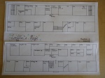
The format of my map makes use of a form of juxtaposition. The floor plan of the first floor is right on top of the magical version of the first level. The same is true for the second floor. I did this because many people do not know the basic layout of Loeffler on a normal day so it would probably be beneficial to see the plain original map. Because the two versions of the map are right on top of each other, it makes it easy to compare my made up magic to real life.
I just wanted to have fun with my map, but I am also extremely OCD so I had to draw out the actual floor plan as accurate as I could. Both versions of my map have the details and precision, but they are different in a few ways. Biggest difference is the use of color on the “magical” map. I wanted to make this version of the map more fun and interesting so I used color and little drawings to help create an image (by the way, my art is terrible so no judgements). The second difference is what each room contains. This was where I let my imagination go and create the ultimate place to learn and have fun (as much fun as you can have while in school). My major purpose behind this map was to offer entertainment and a different view of something that is usually ignored.
Enjoy!
For the Invisible City mapping project I am making a map of the Loeffler Mathematics and Science building right here on the OCU campus. Sound kind of boring? Well never fear, I shall make Loeffler look better than it ever has before. I chose this place to map for two reasons. The first is that I spend 70% of my time in Loeffler so I know it better than most other places. The second reason is because not a lot of people know about everything in this building. We are a dance school, so the sciences are a “hidden” area of the school and only a small portion of the student population spends a lot of time in Loeffler. I think this is an interesting place because it is right here on campus, but very few people know about everything that goes on inside. Maybe more happens than they think…?
The map I am designing by myself is going to be a hidden map much like Loeffler is a “hidden” part of the school. I am going to have a regular map of Loeffler just showing what the building looks like to everyone. The hidden part of the map will show what people don’t see when they enter Loeffler, the magical side of the sciences. I am hoping to incorporate a sense of juxtaposition on my map because I will have two versions of the map of Loeffler that can be placed side by side and be compared.
Now for the big moment, want a sneak peak? Here you go.

Ta-dah!! Okay, don’t get worried this is a very basic map of Loeffler just to help me remember where everything is. I didn’t want to give away anymore details because there is no fun in that. Being surprised is much better in my opinion. So to the AMU students who are on the edge of your seats in anticipation to get maps, be prepared for some magic you didn’t know existed in the sciences.
Hey everyone, I attached my current working draft here because pasting it in was messing up the format and it was really frustrating me. So anyways, happy reading. =)


I found these two maps and they really intrigued me since they were made by the same person, Jeff Wysaski. What I found interesting about the maps above was how they have completely opposite purposes, but they are organized in the same fashion which makes it easy to go in and compare the content on the map.
A quick summary, the map on the left shows what is considered the worst quality of each of the fifty United States, while the map on the right shows the supposed best quality of each state. When I was looking at the maps, I found it impossible to look at them and not make a comparison between the best and worst quality of each state. My mind automatically started looking for ways that the positive quality could impact the negative quality or vice versa. For example, looking at Ohio, I saw that the best quality was that it has the highest library usage. The negative quality for Ohio is that it is the “nerdiest” state. In my mind, this is a plausible connection because nerds tend to be very book smart and dislike social settings so the library is a somewhat ideal place for a nerd to be which explains the high library usage. It turns out my assumption was correct and the explanation given by the data was that “nerdiness” was based on the number of library visits per capita.
Though there are a few connections between good and bad qualities for certain states, other states have qualities that do not relate to each other, but because of the way the maps are laid out, we are still drawn to making comparisons. One example of poor correlation is the state of Wisconsin. The good quality is that they have the highest high school graduation rate. When we look at the bad quality, we see that Wisconsin has the highest amount of binge drinking. Some may look at this and make an incorrect assumption that binge drinking is somehow related to high school graduates, maybe even assume that binge drinking is a way to success in high school. The logic behind that is nonexistent, but when we look at some states (like Ohio) and see a plausible connection, it is easier to make connections for other states even if they do not make sense.

I found this map on the website OkTrends which shows the responses of users from a website called OkCupid which is a free dating service. This website asks its users to answer a variety of yes or no questions, and then diagrams the results from these surveys on maps like the one above. This particular map shows the results gathered from asking participants which right they would rather lose, the right to bear arms or the right to vote. Based on the color scale, we are able to see how different states (except for Alaska and Hawaii) responded to the question on average. As far as audience, I believe this visual rhetoric is directed towards users of OkCupid, but it could also be referring to any person because it asks a question that most U.S. citizens would be able to offer an opinion about.
The color scale for this map can impact the way we view the results. In How to Lie with Maps, Monmonier talks about the red to green color scale. He mentions the common associations people tend to make with these colors. In general people associate “red with danger, yellow with a need for caution, and green with a lower risk” (171). Because of these common associations this map could lead viewers to certain interpretations. For example, if we associate red with danger, we may assume it is more dangerous to lose the right to vote since that is the option resembled by red on this map. Since the right to bear arms is resembled by the color green on the map, viewers may assume losing that right may be a less severe loss. The red to green color scale can be effective in some situations, but I do not think it is the best color scale for the subject of this map.
